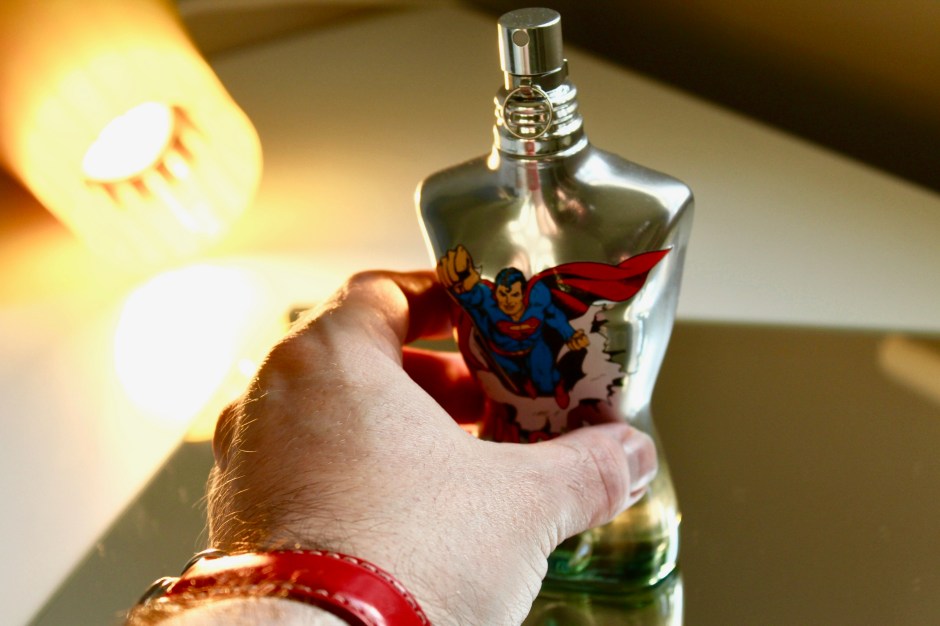
It was as I was setting a bottle of perfume in lime jelly last week in preparation for blog photography that I realised that I may just be a little bit mad. Creative, yes, but also a bit bonkers. Over the last year or so I’ve made a real effort to ensure that any photos that appear on The Candy Perfume Boy are ones I’ve taken rather than marketing shots. You might be wondering why this is, especially as it’s a real effort and it does lead to strange occurrences, such as when I stained my stark white dining table green in my lime jelly endeavours (whoops!). The answer for me is two fold: firstly, I’ve always loved photography but have only recently found a knack for actually taking photos myself (it’s now a thoroughly enjoyable activity for me); and secondly, there is something really fascinating about trying to translate an odour into something visual.
Perfume is the most vivid of the arts, yet it’s the hardest to describe and visualise. With The Candy Perfume Boy it has always been my aim to make the art of olfaction more accessible, explaining and now presenting fragrance in an easy to understand way. This is why I’ve dived so deeply into the world of photography because it can instantly show the spirt or odour of a fragrance just in one image. Translating these scents into a photo is a really fascinating undertaking. It’s fun to be literal, creating tableau’s of a fragrance’s key materials or to put together something entirely more abstract, using art, craft materials, lighting and the natural elements to make something beautiful.
In this post I want to talk about some of my favourite photos from the last year (everything before that was a little bit sketchy to say the least) and how they were put together. They range from brand collaborations to experiments with coffee powder and limes. Some were painstakingly planned and others were winged on the fly. Whether they took hours and multiple attempts, or were right first timers, I’m incredibly proud of them all, and I can’t wait to create more!
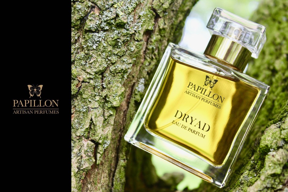
I recently teamed up with Perfumer Liz Moores of Papillon Artisan Perfumes to create some promotional shots for her upcoming fragrance, Dryad. This was a really exciting project for me because it’s the first time that I’ve worked with a brand to create the images they want to represent their fragrance. Luckily for me, Liz was incredibly forthcoming with her inspirations for the fragrance and she supplied me with plenty of backstory, including a beautiful poem written by her daughter, to help me put a picture to the scent. A Dryad is a tree nymph whose fate is tied to the tree in which it makes its home – if the tree dies, so does the Dryad. As far as inspirations go, that’s pretty beautiful.
I spent a lot of time prepping for this one, snapping test shots of woodland scenes to get an idea of how I could place Dryad into the scene. I captured textures and colours, deciding on two concepts; Dryad suspended in the heart of a tree and Dryad amongst the woodland carpet of moss and fallen logs. Liz and I are both over moon with the results, which look as beautiful and woodland-esque as Dryad itself! I can’t wait for you all to smell the fragrance when it launches in June.
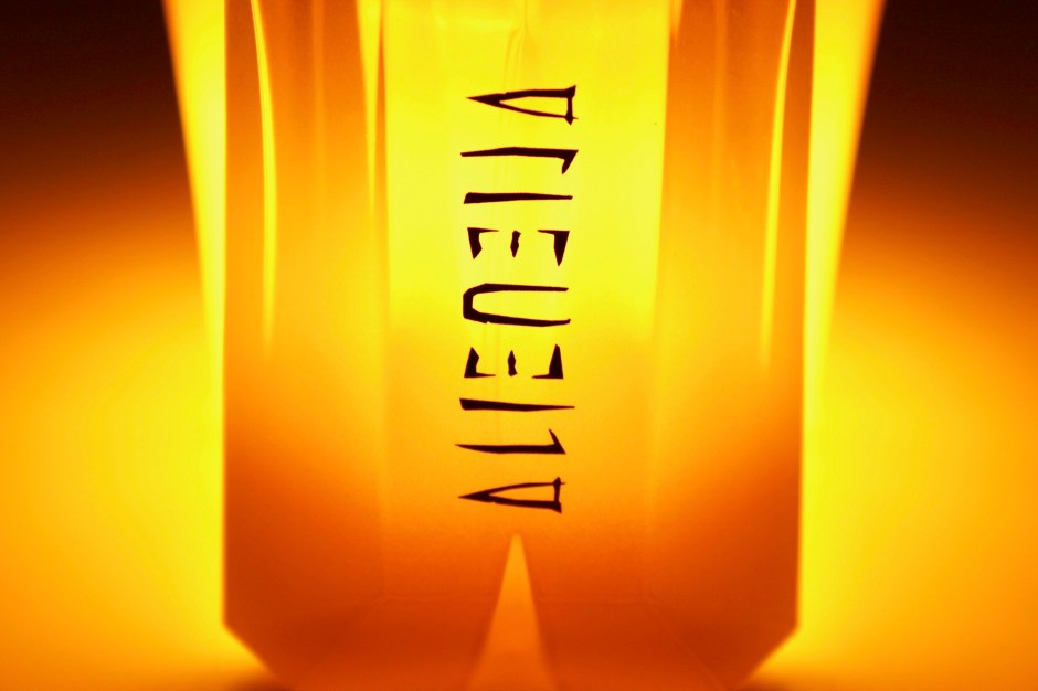
This photo of MUGLER’s Alien Eau Sublime is possibly my favourite of all the photos I’ve taken and it sort of happened on the fly. I don’t have a full lighting set up yet (I’m working on it) so when it came to capturing the solar warmth of Alien Eau Sublime I relied on what I had to hand: a Mathmos Lava Lamp. That’s right, the glowing sunlight behind that bottle of MUGLER goodness is actually a yellow lava lamp turned upside down. I pulled the saturation right up in photoshop to make it even more glowing, et voila: Alien on fire!
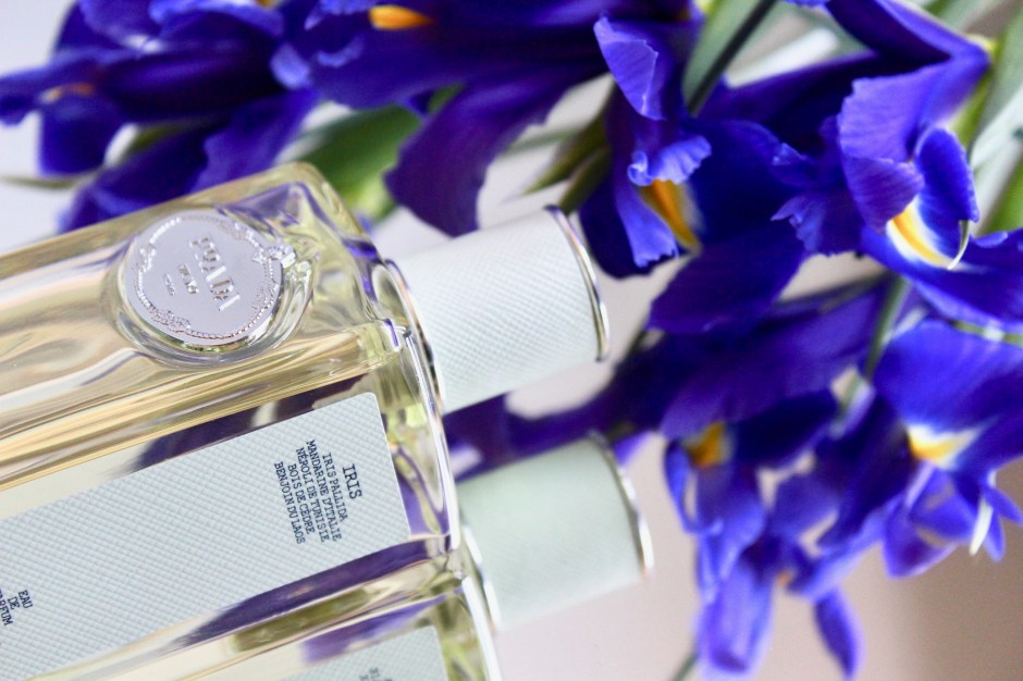
When I had the idea of writing an olfactory deconstruction of orris I had a very clear concept of the accompanying visuals. I wanted to present the idea of fragments of iris. Now, short of being able to slice perfume bottles in half, this isn’t the easiest of things to translate into a visual. I didn’t want to start destroying bottles filled with beautiful iris juices so I went with the concept of placing bottles reflected on mirrored tiles. In this image I loved how the irises seemed fuller than in reality, creating a sense of endlessness. Side note: any reflective surfaces are a pain in the butt to photograph because unless lit from the right angle, one ends up seeing their own face staring back at them in the picture they’ve been trying to capture for hours.
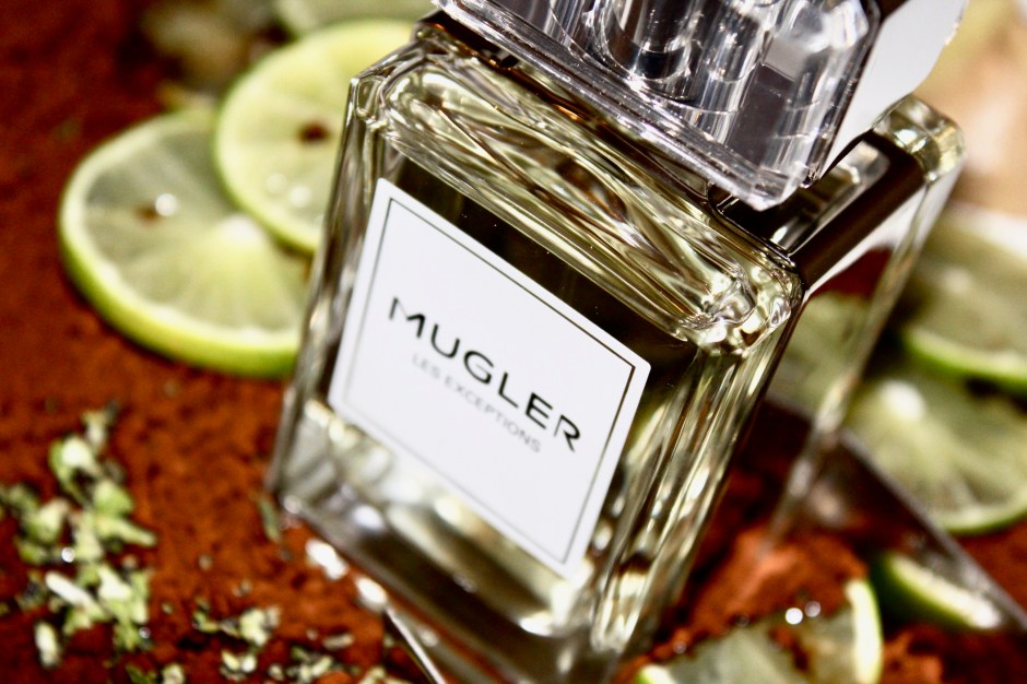
This photo for Hot Cologne by MUGLER is an example of a tableau that showcases the notes within the fragrance. I wanted to show how the fragrance has a cacophonous overdose of lime and coffee so I mixed those two ingredients together to create a bit of a mess. The stark contrast between the green and the brown showcases the same clash of colour within the scent. There was a lot to get into this photograph and it was tricky to ensure that the bottle and the surrounding elements of the tableau were all visible. I added some grated lime zest to give it an even more messy and colourful spread. It was fun to shoot – less fun to clean up…
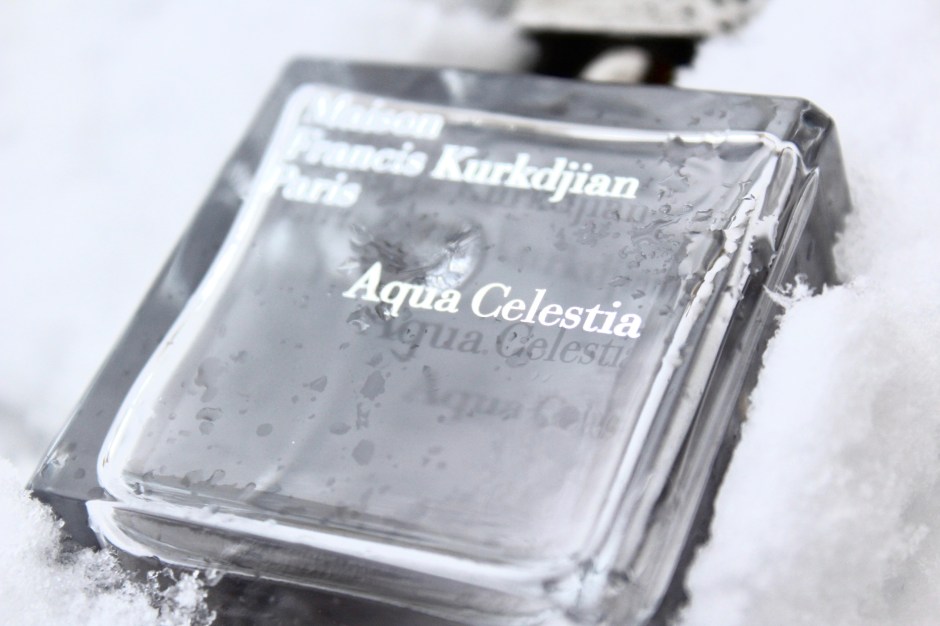
This one’s an example of serendipity. When I tried Maison Francis Kurkdjian’s luminous Aqua Celestia for the first time a vision of fresh white snow flashed into my mind. The fragrance felt as cool and crisp as a snowy day, but on where the sun shined brightly, creating a glistening sheen top the snowflakes. So on a cold February day I found myself leaping for my bottle of Aqua Celestia and my camera as I watched some heavy snow fall outside my window. The result is what you see above and I think it showcases the icy freshness of Aqua Celestia perfectly. Sometimes one just has to seize the moment and go with it!
Sexuality: that’s what I thought of when I smelled Superstitious by Editions de Frederic Malle/Alber Elbaz for the first time. There was something so unashamedly carnal about the fragrance and I wanted to express this in an equally confrontational way. One thing I didn’t want to do was show ‘sexy’ in a conventional way, after all, men and women interlocked in sexy naked time isn’t really reflective of my point of view, so instead I opted to incorporate homoerotic imagery.
When I first started taking photos for the blog and my instagram I would use my iPhone to capture snaps of a perfume bottle against fashion photography or art from books. Sometimes I’d even apply a terrrrrrrrible instagram filter to these. For Superstitious I wanted to return to this style but capture something of a better quality. I used SEX by Madonna and Steven Meisel as the backdrop, using images that showed some of the provocative man-on-man action that made the book so scandalous back in 1992. The results are naughty but also quite beautiful – just like Superstitious!
Work With Me
Do you want photographs for your website or brand? Let’s discuss! Click on the ‘Work With Me’ link at the top of the page and let’s talk about what we can work on together.
Disclaimer
Images are my own.
